Earlier this week I met with a regional representative of a national high profile ministry. He was expressing a desire to attract more monthly donors while lamenting limited success.
Knowing that his local organization was part of a larger national nonprofit, I suggested we do a quick check of the ease of finding and donating to his specific chapter through the national org’s website.
The good news–he was relatively easy to find.
The bad news–when I made an actual donation for his benefit, it took 7 screens to make the gift. Remember, I had already ‘found him.’ All 7 screens were about accepting and processing the gift; none were to designate my gift to the gentleman in front of me. The website had already done that (one good thing). I was also surprised to see that the gift form had shopping cart language on its face (very 2005).
I would love to see the web analytics on how many prospective donors bail on gifts throughout the various stages–screens–of the process. I can tell you with certainty, that there is some percentage bailing.
Online giving forms need to be:
- Simple
- Fast
- One Screen
- Mobile Responsive
- Branded and Seamless
They should look like this: https://wevegothope.org/donate.
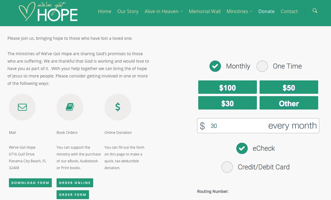
In addition to the attributes listed, this form makes it crystal clear whether the gift is ‘one time’ or ‘monthly’ and leads with the suggested gift amounts the organization is asking for most. It also leads with the eCheck option while making it clear and easy to switch to a credit card gift. (The eCheck is important to offer because folks change their checking accounts less than they get new credit and debit card numbers due to expiration, choice/multiple cards or fraud.)
If your online gift form is more 2005 than 2015, we should talk.

Join the discussion One Comment